
Resume Design: The 2026 Guide to Engineering a High-Performance CV
75% of resumes are rejected by automated filters before a human recruiter ever sees them. It's a cold, technical barrier between you and your next role. You've likely felt the frustration of sending out a polished document only to be met with silence or an instant rejection. It feels like your experience is being erased by a machine. We're here to change that. Effective resume design in 2026 is a matter of high-performance engineering. It's about building a document that functions perfectly under the hood while looking sharp on the surface.
You deserve a CV that earns respect from both algorithms and hiring managers. This guide shows you how to bridge the gap between visual appeal and strict ATS requirements. We'll cover the move toward minimalist layouts, the power of single-column structures, and the specific fonts that ensure your data parses correctly. You'll gain a clear roadmap to create a resume that passes the filters and lands you the interview invitation you've earned.
Key Takeaways
- Master a resume design that balances technical ATS requirements with the visual hierarchy recruiters expect.
- Use a single-column layout to ensure scanning software reads your experience in the correct order without errors.
- Focus your high-impact achievements in the top third of the document to grab attention during the initial six-second human scan.
- Stick to the reverse-chronological format to align with North American hiring norms and provide a clear career progression.
- Select templates that use generous white space and standard headings to make your professional story easy to digest.
What is Strategic Resume Design in 2026?
Strategic resume design is the intentional arrangement of your career history to make it as easy to read as possible. It isn't about making your document look like a piece of art or a marketing flyer. In 2026, a successful design focuses on speed and clarity. You want a layout that helps a recruiter find your most important achievements in a few seconds. If your resume is hard to scan, it gets ignored. High-performance design is about information architecture. It's the difference between a document that gets read and one that gets deleted.
The Shift from Art to Engineering
Hiring in 2026 relies on data. Most companies use sophisticated software to sort through thousands of applications. This shift means resume design is now more about engineering than visual flair. If you add complex graphics, icons, or progress bars for your skills, you're creating technical problems. These elements often break when an automated system tries to read them. A functional, clean design removes these barriers. It lets the recruiter focus on your value instead of struggling with a messy layout. Speed is the ultimate goal.
The cost of over-designing is high. When you use multi-column layouts or heavy images, you risk having your data garbled. An ATS might see your contact information but fail to read your work history. This leads to an automatic rejection. A well-engineered document uses a clear structure to move the reader toward a decision. It's about building a path for their eyes to follow without any friction. You want to present your facts clearly so the machine can process them and the human can appreciate them.
The Dual Audience Requirement
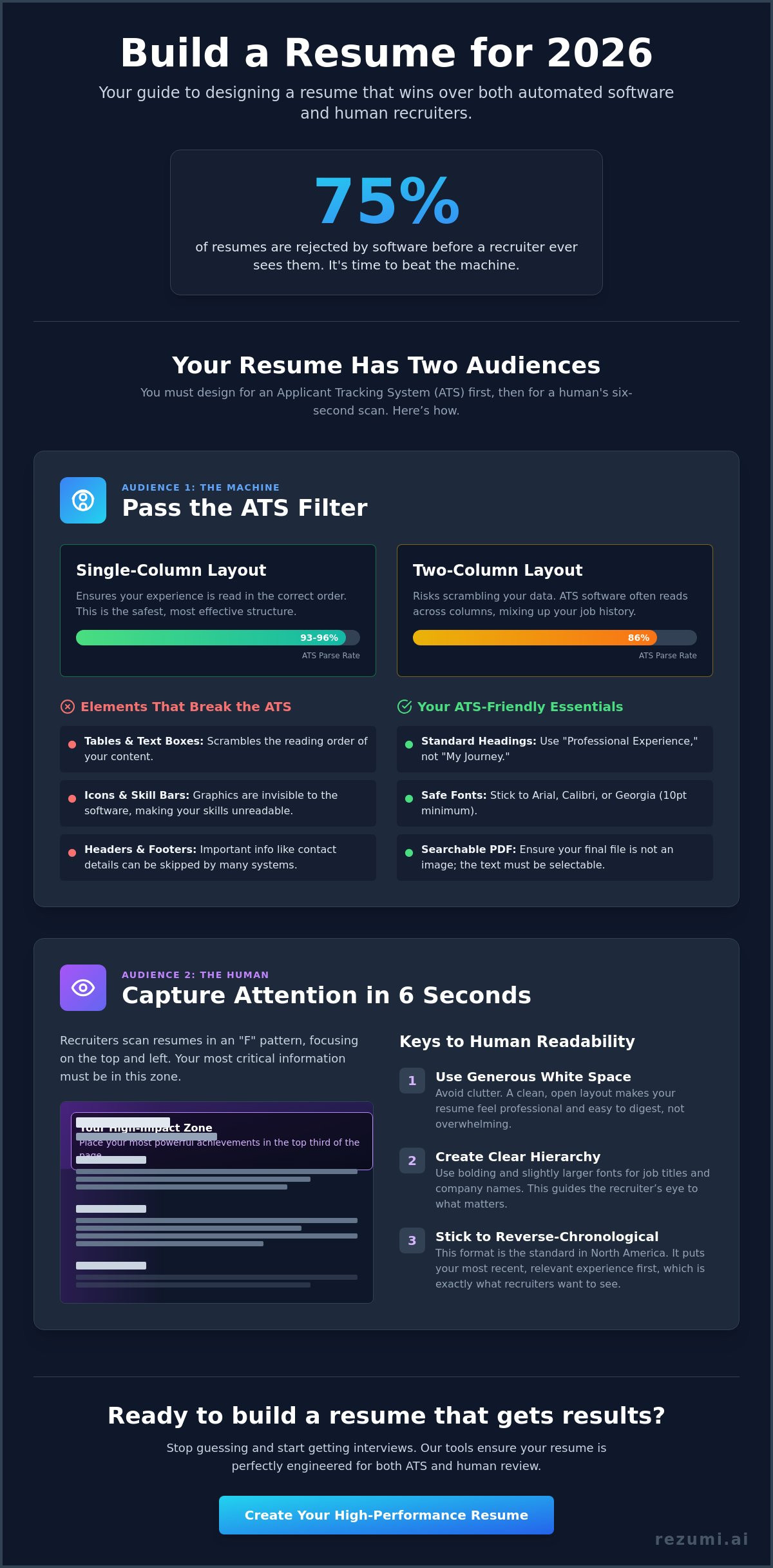
Your resume has to work for two very different audiences. The first audience is the Applicant Tracking System (ATS). This software scans your document from top to bottom. It looks for specific keywords and structures to categorize your experience. If your layout is too creative, the software might miss your best qualifications entirely. You need a design that the machine can parse with 100% accuracy. This means avoiding headers or footers that hide important text from the scanner.
The second audience is the human recruiter. Research shows that recruiters spend roughly six seconds on their first scan of a resume. You have to use psychological cues to win them over in that short window. This includes using plenty of white space so the page doesn't look cluttered. It also means using bold headers to guide their eyes to your job titles and dates. Mastering resume design fundamentals ensures your document is readable for the machine while remaining persuasive for the person. You don't have to choose between a "cool" design and one that actually works. You just need a document that respects how modern hiring works.
Designing for the Machine: Technical ATS Rules
Your resume must be machine-readable to reach a human recruiter. Over 98% of Fortune 500 companies use an Applicant Tracking System (ATS), which is software that screens resumes for keywords and formatting. If your resume design isn't built for this software, your application will likely fail. Research from June 2026 shows that single-column layouts have a parse rate of 93-96%, while two-column templates drop to 86%. To ensure your data is read correctly, you must stick to a traditional, vertical flow. This isn't about being boring. It's about being visible.
Standard headings are non-negotiable. Use "Professional Experience" and "Education" rather than creative titles like "My Professional Path." Software looks for these specific markers to categorize your history. You should also place your contact information in the main body of the page. Many systems still struggle to read text tucked away in headers or footers. If the machine misses your phone number, you've lost the opportunity. Always export your final document as a searchable PDF to ensure the text remains selectable and readable.
Elements That Break the ATS
Tables and text boxes are the primary causes of parsing errors. They scramble the reading order, making your experience look like a jumble of unrelated words. Icons and skill bars are equally risky. While they look modern, they are invisible to most screening tools. If you want to use lines or borders to separate sections, keep them simple. This maintains a clean look without confusing the software logic. You can verify your document's technical health with our ATS resume optimization tools before you apply.
Font Choice and Typography
Your choice of font impacts both machine reading and human scanning. Stick to safe, standard options like Arial, Calibri, or Georgia. These are clean and easily recognized by all major systems. Keep your body text at a minimum of 10 points to ensure it is legible on digital screens. You should use bold and italics only to highlight specific data points, such as job titles or quantifiable achievements. Following these visual hierarchy principles helps you balance technical needs with professional aesthetics. Avoid using more than two different fonts to keep the document looking cohesive and focused.
Visual Hierarchy: Designing for the Human Scan
Your resume design must capture a recruiter's attention in six seconds or less. Once you pass the automated filters, a human eye takes over. They don't read your document from top to bottom like a book. Instead, they scan it in a pattern that looks like the letter F. You must place your most impressive achievements in the top third of the page to win this quick review. This area is your prime real estate. If your biggest wins are buried at the bottom, they might never be seen.
Alignment is another critical factor for speed. Always align your text to the left. This matches natural Western reading patterns and makes your professional story feel familiar and easy to digest. Centered text or justified blocks create uneven spaces that slow the reader down. Keep your bullet points short and punchy. Each bullet should be no more than two lines. If a point is longer, it becomes a paragraph that recruiters will likely skip. Focus on results and data to keep their interest high.
The Power of White Space
White space is a functional tool, not just empty room. A cramped resume with tiny margins causes immediate recruiter fatigue. It makes your career look messy and overwhelming. To prevent this, set your margins between 0.5 and 1 inch on all sides. This creates a professional frame for your content. Use line spacing between 1.0 and 1.15 to give your text room to breathe. Proper spacing ensures that your lines don't blend together, which helps the eye move quickly from one achievement to the next.
Strategic Use of Bold and Color
You can guide the recruiter's eyes using bold text and subtle color. Use bolding to highlight your job titles and company names. This lets a hiring manager see your career progression at a glance. A single accent color, like a deep navy or a professional slate, can give your resume design a modern feel. It helps you stand out without looking unprofessional. Avoid bright or neon colors. These distract from your qualifications and can be hard to read on bright office monitors. Stick to one accent color to maintain a clean, high-performance look that signals you are a serious candidate.
Choosing the Right Layout for Your Career Stage
The layout you select acts as the foundation of your resume design. It dictates how recruiters and software interpret your professional timeline. You must choose a structure that emphasizes your current value while minimizing any perceived gaps. Picking the wrong format can make even a high-performer look like a risky hire. Your goal is to make your progression look logical and inevitable. The right layout creates a roadmap that leads directly to your next interview.
Chronological vs. Functional Designs
The reverse-chronological format is the gold standard for North American hiring. It lists your experience starting with your most recent role and moves backward. Recruiters prefer this because it clearly shows your career trajectory and recent wins. If you have a steady work history, this is your best option. It is also the easiest format for an ATS to parse because it follows a standard chronological logic. Most successful candidates stick to this format to avoid any confusion during the screening process.
Functional layouts focus on skills rather than dates. You might be tempted to use this if you are changing careers or have employment gaps. However, recruiters often view these with suspicion. They might assume you are hiding something. A better approach is the hybrid design. This combines a brief skills summary at the top with a standard chronological work history below. It gives you the best of both worlds by highlighting your competencies without breaking the expected timeline.
North American Formatting Standards
Standardization is key to a professional resume design. In the United States and Canada, you must use US Letter size (8.5 by 11 inches). Do not use A4 paper, as it will not print or display correctly for local recruiters. You must also exclude personal details that are common in other countries. Never include your age, marital status, or a headshot. North American hiring laws focus on qualifications. Including these details can lead to your resume being discarded to avoid legal bias.
The one-page rule is no longer a strict requirement. As of April 2026, two-page resumes are acceptable and common for candidates with 10 to 15 years of relevant experience. This provides the space needed to quantify your impact at multiple companies. However, if you are a recent graduate, stick to one page to keep your message focused and punchy. You can find templates built for every career stage in our Resume Design and PDF Export tool. This ensures your formatting meets local standards while looking modern and refined.
Implementing Your Design with Rezumi AI
Execution is where most job seekers fail. You can understand all the technical rules of resume design, but manual formatting in traditional word processors is often a nightmare. One small change to a margin can shift your entire layout. Rezumi solves this by acting as your technical partner. We have engineered every template to meet the strict parsing requirements of 2026 while maintaining a sharp, professional aesthetic. You get a document that is ready for a high-stakes job market without the manual labor.
Our platform places your data with precision. You don't have to worry about whether your phone number is invisible to a scanner or if your job titles are correctly categorized. We build the information architecture for you. This ensures that your contact information and core headers are always in the specific locations where ATS software and human recruiters expect to find them. It turns a stressful design project into a streamlined, data-backed process.
Automated Formatting and Optimization
Rezumi handles the complex engineering of your layout so you can focus on your achievements. We apply the single-column rules and font standards discussed earlier to every document automatically. If you want to try a different look, you can switch between professional styles with one click. Your data will reformat instantly without breaking the reading order or scrambling your bullet points. This flexibility lets you test different visual hierarchies to see what fits your career stage best.
Consistency is vital for a professional brand. Our system ensures your resume design matches your cover letter perfectly. When a recruiter opens your application, they see a cohesive set of documents that signal attention to detail. We use our AI Cover Letter Generator to pull the right keywords from your resume, ensuring your entire package is optimized for the specific role you want. It is a complete system built for serious results.
Final Polish and Export
Before you send your application, Rezumi provides real-time feedback on your layout. Our system checks your content density and white space. If your paragraphs are too long or your margins are too tight, we let you know immediately. This prevents the recruiter fatigue that often leads to instant rejection. We act as a final quality control layer, catching formatting errors that could trigger an ATS red flag.
Your final step is a clean, searchable export. We provide the exact PDF format that North American employers expect. This file keeps your text selectable for machines while preserving your visual hierarchy for humans. You can check out our pricing plans to start building your high-performance CV today. Stop wasting time on designs that don't work and start using a tool that is engineered to win.
Take Control of Your Career Path
Your job search shouldn't be a game of chance. By moving from artistic flair to functional engineering, you're already ahead of the competition. You now understand that a high-performance resume design balances technical ATS rules with the visual hierarchy humans need. This strategic approach turns your document into a tool that works for you around the clock. It makes your professional value impossible for recruiters to ignore.
Managing these complex formatting rules doesn't have to be a manual chore. Rezumi offers a platform engineered specifically for North American hiring standards. You'll receive real-time ATS feedback to ensure your document parses perfectly every time you apply. Thousands of successful professionals have already used our system to secure more interviews and land better roles. It's time to replace the anxiety of the unknown with a data-backed strategy that gets results.
Build your ATS-optimized resume with Rezumi and take the uncertainty out of your application process. You have the experience and the skills. Now it's time to ensure hiring managers actually see them. You're ready for the next step in your career.
Frequently Asked Questions
Is a one page resume design still required in 2026?
Two-page resumes are acceptable for experienced professionals in 2026. If you have 10 to 15 years of relevant experience, you need the extra space to quantify your impact and show career growth. Modern hiring managers prefer a detailed, two-page document over a cramped one-page version that cuts out important achievements. Recent graduates should still aim for a single page to keep their message focused and punchy.
Can I use columns in my resume design if I use an ATS friendly builder?
You should avoid multi-column layouts even when using an AI builder. Research from June 2026 shows that single-column designs have a 93% to 96% parse rate, while two-column layouts drop to 86%. Standard ATS software reads from left to right across the entire page. Using columns can cause the machine to scramble your work history and education, leading to a garbled profile that recruiters will ignore.
Should I include a photo in my resume design for US or Canada jobs?
Never include a photo for job applications in the United States or Canada. North American hiring laws are designed to prevent bias based on age, race, or gender. Including a headshot can lead to your resume being rejected immediately to protect the company from legal claims. Stick to a clean, text-based resume design that focuses entirely on your professional qualifications and measurable results.
What are the best fonts for a modern resume design?
The best fonts for 2026 are clean, sans-serif options like Inter or Calibri for digital reading. If you prefer a more traditional look, Georgia is an excellent serif choice that remains highly legible for both humans and machines. Avoid decorative or handwritten fonts because they often fail to parse in an ATS. Keep your body text at 10 points or larger to ensure it stays easy to read on high-resolution screens.
How do I make my resume design stand out without using graphics?
You can make your document stand out by using generous white space and bold, quantifiable metrics. High-performance resume design relies on a clear visual hierarchy that guides the recruiter to your biggest wins in the top third of the page. Use bold text for job titles and company names to make them pop instantly. You can also use a single accent color for your headers to add a modern touch without breaking the scanning software.
Does the file name of my resume matter for design and tracking?
Your file name is a critical part of your digital presentation and should be professional. Use a standard format like Firstname-Lastname-JobTitle-Resume.pdf. This makes it easy for recruiters to find your file in their database or downloads folder after the initial scan. Avoid generic names like Resume-Final-V2 because they look unprofessional and get lost in a sea of similar files, making you harder to track.
Can the ATS read colors and bold text in my design?
Modern ATS systems can read bold and italic text, but they don't process color as a data point. You should use bolding to emphasize your job titles and key achievements for the human recruiter. Color is safe to use for visual appeal, but never use it to convey vital information. For example, don't use a red font to indicate a critical skill because the software won't recognize the meaning behind the color change.
Is it better to use a template or build my own resume design from scratch?
It is almost always better to use a professionally engineered template. Building from scratch in a standard word processor often leads to hidden formatting errors that confuse scanning software. A dedicated platform ensures your margins, fonts, and headers meet current industry standards. This saves you hours of work and guarantees that your document will be readable by every major ATS platform used by Fortune 500 companies.
Disclaimer
This article is provided for general informational purposes only and does not constitute professional, legal, financial, or career advice. While Rezumi strives for accuracy, we make no warranties as to the completeness or reliability of this content. Hiring practices, ATS behavior, and job-market conditions vary by employer, industry, and region — always verify against your specific situation. Any action you take based on this article is at your own risk.
